November 19, 2006
When Type Goes Bad
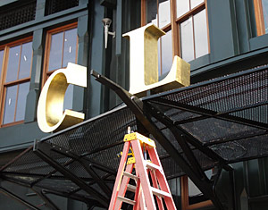
Installing signage at Clyde’s Restaurant. We were hopeful.
When the Smithsonian American Art Museum closed for renovations in January 2000 the neighborhood surrounding its building was neglected and deserted (especially when the Federal workforce left for the burbs at the end of the day). What a difference six and a half years made.
Our museum, open since July, is now right in the middle of a vibrant city life with restaurants, shops, and sports events. So rich is the night life that we changed the Smithsonian’s traditional hours from 10–5:30 to a later 11:30–7 to take advantage of the after work crowds.
Over the years my fellow museum workers watched as the area morphed. We documented each store and restaurant opening. And we took our lunch breaks exploring our new metropolitan environs en masse. When Urban Outfitters and Bed, Bath, and Beyond joined a multiplex and a bowling alley just a few doors from each other, we knew we were truly witnessing an urban renaissance.
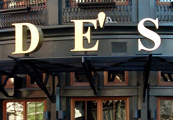
A few months ago I photographed the workers installing what looked to be beautiful 3-D signage for a local upscale eatery, Clyde’s. But returning a few days later to view its completion I was shocked to discover a huge 3-D typographical faux pas: they had used a tick mark instead of an apostrophe to indicate the possessive!
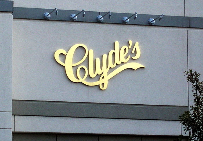
I was shocked. Truly shocked. In addition, the kerning between the “tick” (also known as a prime symbol) and the “E” before it was excruciatingly close. It was painful to view. Oddly, the type treatment for their new restaurant strayed from their corporate logo (which uses an anatomically-correct apostrophe) used as signage at their other locations.
What went wrong? And who could I commiserate with? Who would understand the depths of my type trauma? So I sought out our museum print designer to tell my tale. She alone, I thought, would understand. And indeed, together we breathed a collective sigh of indignation.
I was so incensed I shot off an email to Clyde’s management:
I have eaten at many of your restaurants and was looking forward to the opening of your new place on 7th Street since I work close by.
I enjoyed watching the beautiful letters of your name being installed a few days ago. However, today when I passed by to view your completed signage I was disappointed to see the apostrophe you used.
In fact, it’s not an apostrophe at all, but rather an inch mark. The type you used to spell out your name is a beautiful serif typeface (and it was great to see each letter in 3-D). The mark you use for the apostrophe is not only incorrect but sits way too close to the E.
Such an elegant sign of for an elegant restaurant ruined by this error.
I will not be eating there until you change it.
I have put my money where my proper punctuation resides. But so far they have not returned my correspondence. And the tick remains (both on their sign and in my heart).
Related Links: Apparently I’m not the only one to defend the apostrophe and point out a few additional typographical mishaps. (Via Kottke) Also, check out The Atrocious Apostrophe photo pool at flickr. I am, indeed, not alone.
View Most Recent Story![]() :::
:::![]() Notify me when there's a new missive!
Notify me when there's a new missive!


 ShareThis